Monday, 19 September 2011
FINAL MODEL - P2
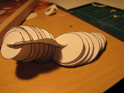
The card combines with the acrylic fitted quite well. This shot focus on the main curve of the whole part, and even more it shows the hierachy of white, good-looking card circles.
[OPTIONAL] MY ACRYLIC MODEL
I found this one so beautiful when I took an overexposure shot. It flashes much and look-like gold but transparency. The problem is it couldn't stand well, just a very little, soft move can causes it collapses. Somehow, the acrylic is just slippery, and I feel like there are very tiny gaps between each parts. I'm new to the laser cutting.
SKETCH MODELS
 |
| I would like to improve the stand, I took inspiration from a sphinx |
 |
| Tried to use paper, bring a softer look |
 |
| Tried to figure out how the circle combines with the main curve |
 |
| Tried another one with much curvier |
 | ||||||||||||||||||||||||||||||||||||||||||||||||||||||||||||||||||||||||||||||||||||||||||||||||||
| White card combines with aluminum wire |
It's so simple, but I visualized somehow my model should look like. The stand still need lots of improvement
SKETCHES IDEAS
I did draw very roughly some ideas pop-up in my mind...
 |
| Some thoughts on the joints |
 | |
| Initial idea |
 |
| More complex joints (but I don't like to use) |
STARTING WITH THOSE CURVES
I researched on my work here in different angle, tried to recognize some main curves that I like to take from this model.
The red and green here are showing the way how I like model should look like
The red and green here are showing the way how I like model should look like
LAST PROJECT'S FINAL !!
Oh well, I wondered why didn't I take a shot from the last project final render? I really liked it, and it has lots of curves as well... Here I got a review.
From different angles
 |
| How the final looks like |
From different angles
Subscribe to:
Posts (Atom)


